
Web, UX and Accessibility

Student Life Web, UX and Accessibility Policies and Guidelines
The Web, UX and Accessibility team, hereinafter referred to as the Web team, manages all websites for the Division of Student Life, providing expertise in design, layout and functionality. This centralized website management ensures quality, consistency and compliance with accessibility standards.
The Web team also coordinates edits and updates for other non-Student Life websites.
The Web team oversees digital accessibility initiatives of the Division of Student Life, ensuring WCAG 2.1, A and AA compliance for all of Student Life’s digital channels and content.
Our team also conducts user experience research in support of digital and marketing initiatives, including usability studies, focus groups and interviews. Our staff and interns are certified by the UD Institutional Review Board to conduct user studies.
Supported content management systems:
- Adobe Experience Manager (AEM)
- WordPress
- Google Sites (Henquarters staff intranet)
Role of Department and Unit Staff
Websites should be kept up to date on a frequent basis—as often as information changes. Each department or unit is responsible for reviewing their content and submitting regular updates. Content that is not current may be removed without prior notice at the discretion of the Web team.
How to Request Website Updates
Quick edits: For smaller, immediate copy edits or updates to Student Life websites, staff can email sl-web-team@udel.edu. The Web team requests a 1–2 business day turnaround time for small updates and edits, but these are often completed in less than 24 hours. Please note in your request if the update is urgent.
New pages: For extensive changes, such as requests for new pages or page redesigns, staff should submit their request through the SL Comm Project Request Form so the SL Comm team can assist with content development. Please allow 7–10 business days for these requests.
Website redesigns: The Web team will work with the department to establish a timeline for delivery. The timeline will depend on other large priority projects and redesigns already in the queue. The redesign process will include a user experience research phase to gather student feedback on the content, design and structure.
Analytics Dashboards
Standard data dashboards are available for the following Student Life websites:
- Career Center Website Dashboard
- Center for Black Culture Website Dashboard
- Community Standards & Conflict Resolution Website Dashboard
- Disability Support Services Website Dashboard
- Division of Student Life Website Dashboard
- Fraternity and Sorority Leadership & Learning Website Dashboard
- Orientation & Transition Programs Website Dashboard
- Residence Life & Housing Website Dashboard
- Student Diversity & Inclusion Website Dashboard
- Student Life Blog Website Dashboard
- Student Support Website Dashboard
- Student Wellbeing Website Dashboard
- University Student Centers Website Dashboard
You can change the scope of the data using the date selection dropdown, or review the data for specific pages or groups of pages using the "Filter by page" dropdown.
Content and Design Guidelines
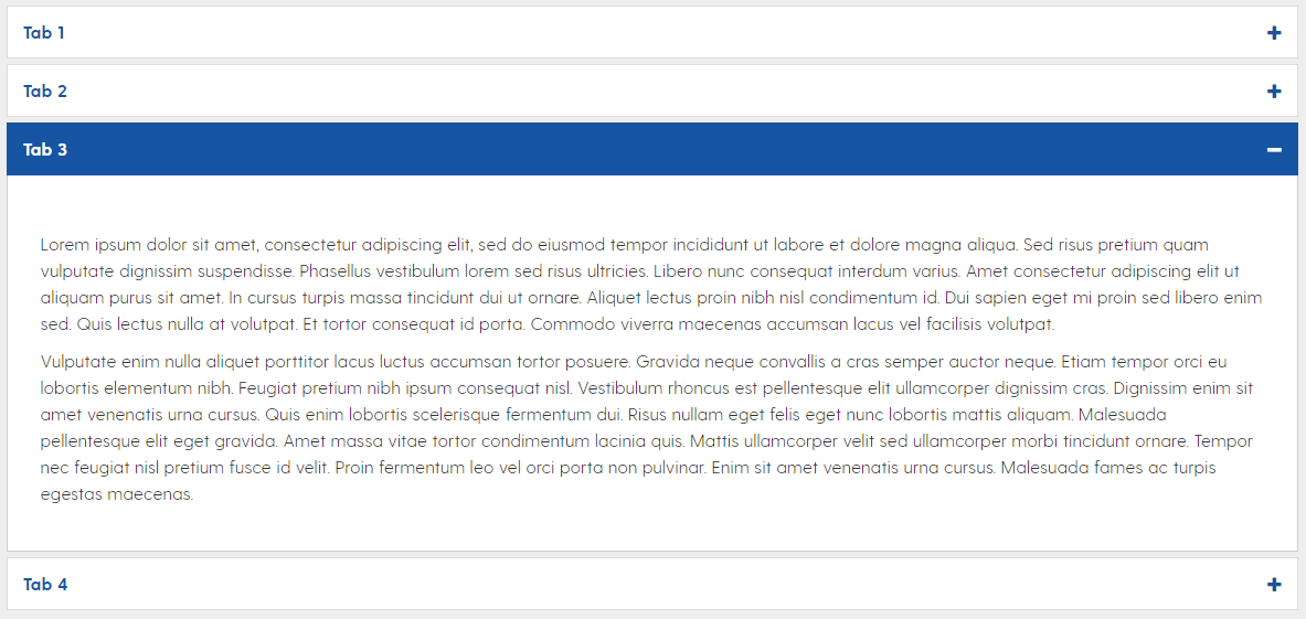
Accordions can be used to reduce page length and clutter, improve scanability and minimize scrolling; however, they can reduce visibility and increase interaction cost.
- Accordions should be used primarily for information that is less relevant to the user, thereby reducing cognitive load.
- Avoid using accordions for:
- Essential information or critical calls-to-action
- Small bits of information, such as a single link or sentence.
Accordions cannot be nested inside other accordions. This creates an accessibility issue.
The Web team will use the approved UD color palette and will adhere to the UD Color Accessibility Chart and WCAG contrast standards.
Colors outside the palette can be added to the page through imagery and photography.
Requests for custom colors may be approved depending on need (e.g., diversity or culturally-significant colors or custom branded event series).
Color should not be used as the sole means of conveying information.
The Web team will avoid the use of stock photographs and images.
Images of text should also be avoided. If there isn't a more suitable option, the text will be included as image alt text and in the body copy of the page
In certain instances, a shortened URL may be appropriate, such as:
- Promotional items with small imprint areas
- Digital signage
- Print materials
The Web team will request official "udel.edu" friendly URLs through the Office of Communications and Marketing (OCM) on a limited basis.
Friendly URL requests are reviewed and approved by OCM through twice-monthly deployments, on the second and fourth Monday of each month. Please plan accordingly.
Link text should be meaningful for accessibility compliance. Do not use “click here" or "read more."
Don’t use a url as link text. (e.g. https://www.udel.edu/apply/undergraduate-admissions/)
Avoid repetitive links on a single page—especially within the same section.
- The link text for email addresses should be the email address, not a name (e.g., Contact johndoe@udel.edu for information).
PDFs are meant for distributing documents that users will print. They are not inherently accessible, and are not optimized for browser and mobile device viewports. When possible, the Web team recommends avoiding the use of attached PDFs on websites and in email communications.
Linking to a Google Doc or Sheet from a website should also be avoided. These formats are also not inherently accessible and can be unreliable if access permissions change.
The Web team will review all PDFs and documents to determine the most appropriate format for the content. In most cases, the content should be converted to a new web page or HTML content on an existing page.
A PDF may be appropriate if the document:
Cannot be represented as web content
Needs to be printable
Is a fillable form or worksheet
Documents and PDFs that meet these criteria and are linked from UD websites or related online platforms must comply with Web Content Accessibility Guidelines 2.1, level A and AA standards. The PDF Accessibility Checker in Adobe Acrobat should be run to fix any accessibility issues. The Web team will review and perform final accessibility remediation on PDFs before they are uploaded to our websites.
Documents and PDFs should also be reviewed by the SL Content team for AP style and branding before being uploaded to the web.
When a revision of an existing PDF on a website is needed, please note the revision date in the document itself (e.g. in the footer), not in the filename.
Please note: The Web team is not responsible for maintaining an archive of departmental documents. Old versions of documents or PDFs will be deleted when new versions are uploaded.
Requests for new web pages will be reviewed by the Web team. In some cases, a full page may not be necessary or recommended. We will consult with your team to find the best solution for including the content.
Pages should have a cohesive theme and topic or a primary call to action.
Text volume should be limited on a page to ensure the content is consumable and user-friendly. Keep in mind that text is compressed on mobile, potentially increasing the perceived volume.
If content is low-volume (less than 250 words) or related to content on an existing page, adding it to that existing page may be the best solution.
More pages mean more clicking. Minimizing clicks eases users’ experiences.
Anchors can provide direct links without separating pages.
Event Pages
The Web team will not create web pages to promote individual, one-off events. One-off events can be promoted through the UD Events and Student Central calendars, social media and the Blue Hen Life newsletter. The only exceptions to this are:
Signature event series that span a full semester (e.g., Perkins Live, Trabant Now)
Signature series that span multiple days and are comprised of multiple events (e.g., UD Welcome Days, Parents and Family Weekend, Geek Week)
Full day conferences with multiple sessions (e.g., Student Life Conference, Amplify Leadership Conference)
SL Comms will review and edit submitted copy to meet branding, AP style, accessibility and readability guidelines. We are happy to share insight into the changes and aim for consensus, but please be aware SL Comms is the final authority on web deliverables.
Readability of web copy:
Text should be easily understood to provide maximum access to the widest audience possible. Use clear and simple language.
In general, SL Comms aims for a Grade 8–9 reading level.
Use the Hemingway App to check and improve the readability of your text.
Tips for Readable Text
- Kill the welcome mat: Cut to the chase. The average user will only read 20–28% of words on a web page. Don’t waste word count on generic, feel good material. — Nielsen Norman: How Users Read on the Web
- Make text scannable:
- Highlighted keywords (this includes hyperlinks)
- Meaningful subheadings
- Bulleted lists
- One idea per paragraph
- Half the word count (or less) than conventional writing
- Use the inverted pyramid: Present the most important information (or conclusion) first.

- Avoid jargon: Use simple, clear language. Aim for a 8–9 grade reading level.
- Break text into short sentences: Aim to make your sentences between 14–20 words. Studies have shown that reading omprehension decreases as sentences get longer. Clear, concise content also tends to be more accurately represented in AI-generated overviews.
- Use active voice.
- Be brief:
- Avoid redundancy. Cut words or phrases that reiterate the same idea.
- Trim expletives or unnecessary modifiers.
- Remove excess information that isn’t needed for comprehension.
- Leverage bulleted lists:
- Write list items to have similar line lengths.
- Use parallel sentence construction for all list items.
- Avoid repeating the same word(s) at the beginning of each list item.
- Keep formatting consistent (i.e. capitalization and punctuation).
- Format text appropriately:
- Avoid using ALL CAPS.
- Use bold if you need to emphasize text.
- Limit the use of italics. One possible use case is for footnotes.
- Don't use underlines, as the text may be confused for a link.