
AEM Components List
AEM Authoring Components List
Within AEM, components are utilized to define the functionality and design of a page. They are the building blocks for creating your web pages.
Components are dragged and dropped onto a page. To break up a page horizontally, components are dragged into Column Generators; A Column Generator breaks the page into separate columns with either a three-column 33-33-33 (%) division, or a two column 33-66 (%), 66-33 (%) or 50-50 (%) division.
To break up a page vertically, Panel components may be used. Panels may be assigned a background color, a background image, or a fixed position (parallax effect) background image.
After creating a Panel or Column Generator, other components may be dragged inside the newly created areas to form the page's content and give life to the layout you've made.
See below for a complete list of the available authoring components and their usages.
Full Component List
UDEL General Components
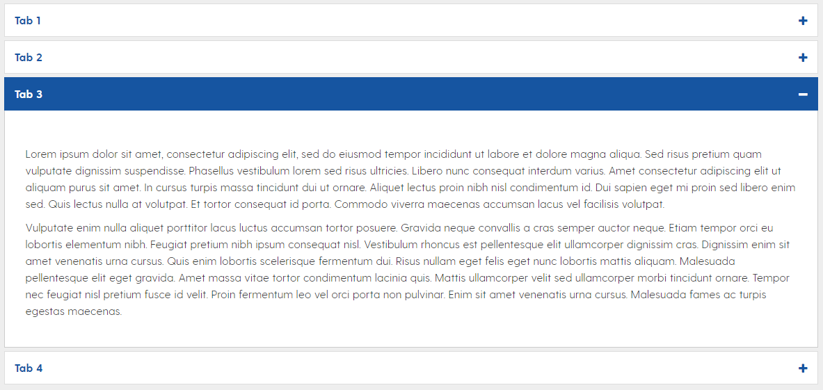
The accordion component provides a clean way to include lots of page content in a compact space.
Each accordion tab may be assigned a unique ID to link directly to it, using a URL ID parameter (e.g. "...link#id_here")
Note: Accordion boxes appear open in edit mode for easy editing but will close in preview mode.
The add style or script component may be used to embed custom HTML/JavaScript/CSS that is not covered by other components.
- Ideal for audio, social feeds, non-AEM forms, etc.
- Note: For YouTube and UD Capture Space videos, please make use of External Video.
The call to action component provides a convenient, colorful way to present button links to users.
Multiple background color options
Ability to use a custom FontAwesome icon
Optional arrow display

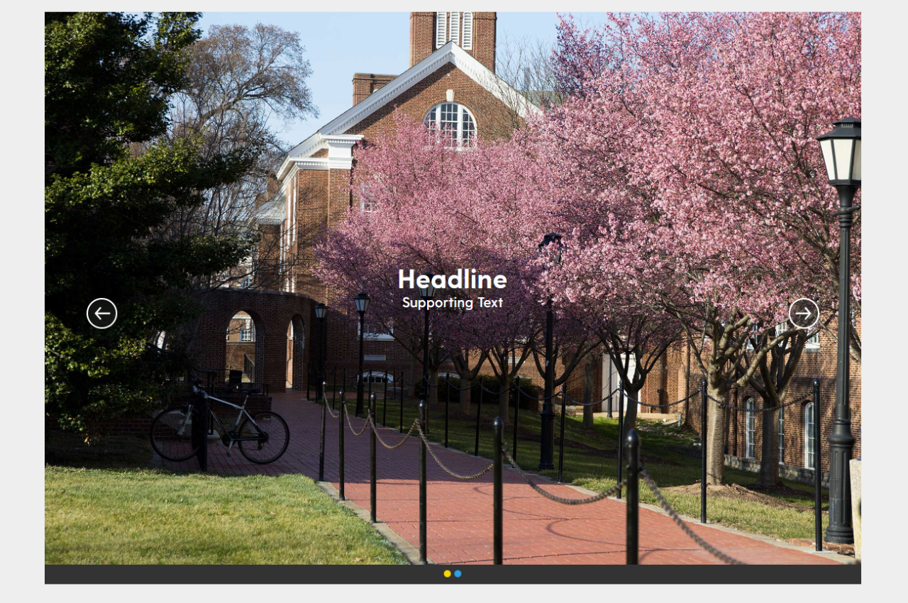
The carousel component creates an image slider with optional supporting text and link options.
Can be made clickable, with a link destination
Optional text overlay
No captions for photos
Note: Please be sure to complete the title and alt text, for accessibility purposes
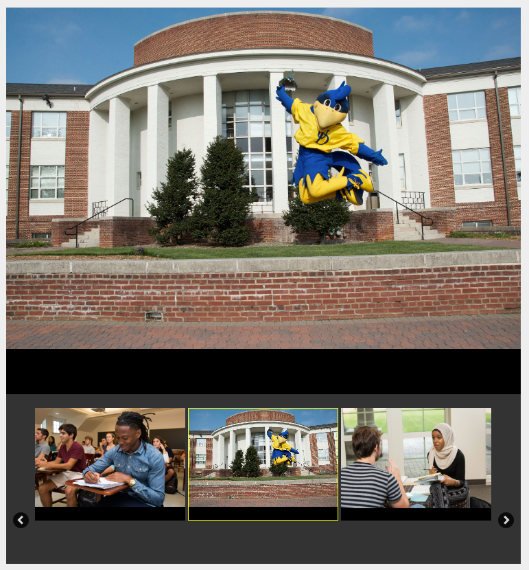
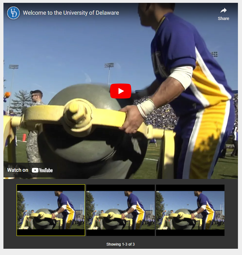
The carousel playlist component provides an asset slider for DAM photos/videos OR YouTube videos.
- May only display one of either DAM assets or YouTube videos.
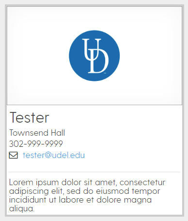
The contact component provides a means of displaying unit or personel contact information in a clean, uniform manner.
- Image not required
- Note: Please be sure to complete the title and alt text, for accessibility purposes
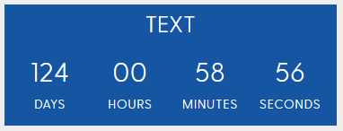
The countdown clock accepts a target date and time along with header text to display.
- Allows the customization of colors and style
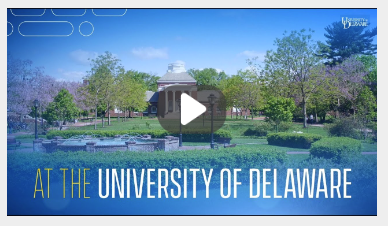
The external video component scales and uniformly displays YouTube or UD Capture Space videos for all browser/window/device sizes.
- For YouTube videos, paste the last part of the video URL into component dialog (see information text on the dialog field)
- For UD Capture Space videos, paste full video iFrame code into component dialog
- Note: This component will also accept YouTube playlists, but they will not be uniformly styled.
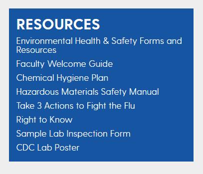
The group of links component provides an easy way to cleanly list links out to pages. This list is auto-generated, ordable, and will update without intervention if matching pages are added or removed.
Links list can be chosen manually or through tags
Several color options, just keep accessibility in mind when choosing.
Headline text has the option to link out to specified destination
The image component is the core method to display image content on pages.
Optional image caption
Note: Please be sure to complete the title and alt text, for accessibility purposes

The list component provides a quick way to organize links into a stacked format. Unlike the Group of Links component, the list component is not auto-generated or orderable. All content is manually created.
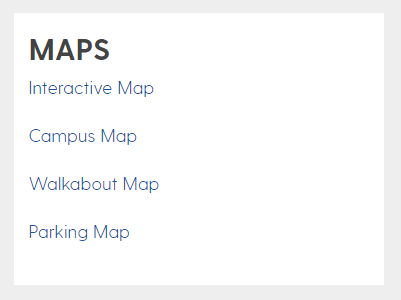
The matrix details component allows configuration of customizable data inputs for use with the Matrix Filtering component
- See AEM Matrix Component Guide for usage
Note: Please be sure to complete the title and alt text, for accessibility purposes

The matrix filtering component may be used to create flexible, modular content search areas with configurable fields for how the user may filter the list of AEM pages.
- See AEM Matrix Component Guide for usage
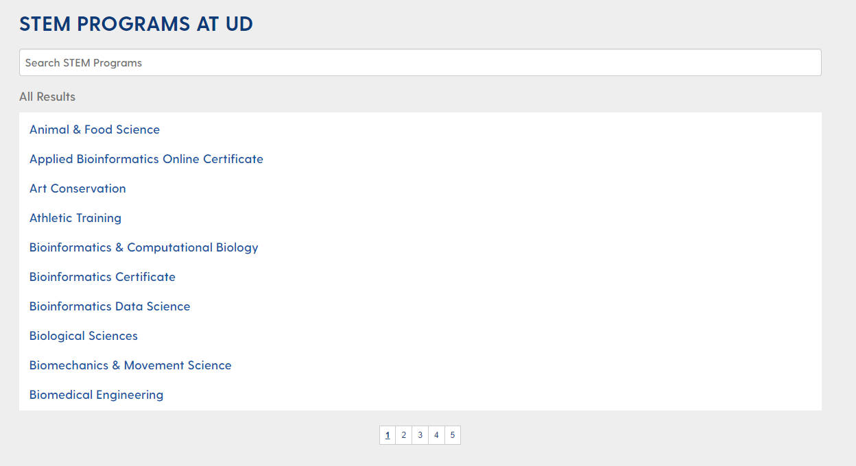
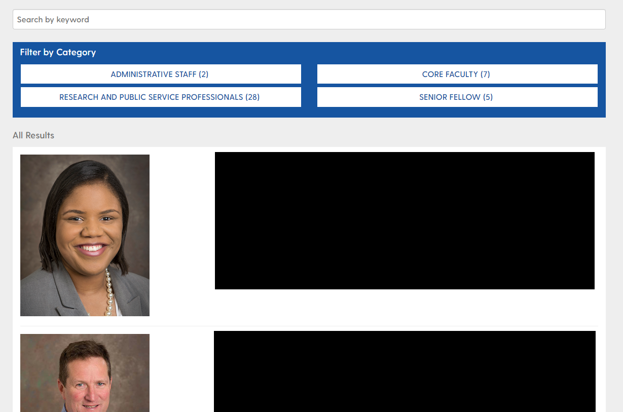
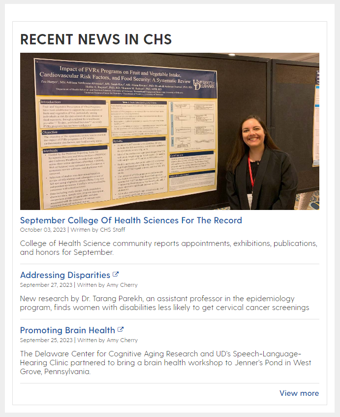
The portal latest news component accepts a News Portal path to display recent stories from. The stories are automatically pulled to this component as new portal posts are created.
- Offers flexible display options
Featured story is optional. If none is selected, the most recent story will display
One or more tags can be used to specify story types
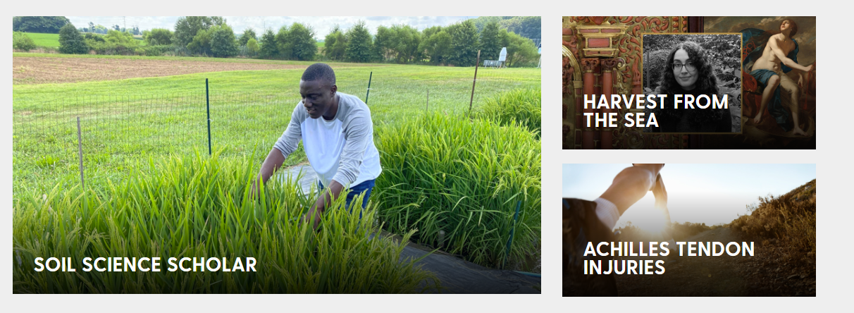
The Portal Featured Story component accepts a news portal story path to display the image and title from, providing a nice way to encourage readers to click through to read the story.
The pull quote component accepts input to create styled, text block quotes.
Can be left or right aligned
Optional quote author field
Several background color options

The reference component allows authors to create sets of components (reference column generators) in a central, organized location that may then be used elsewhere on the website. When a reference is updated, all pages pointing to that reference will also see these changes reflected.
- Note: Please configure a "Reference Title" in the reference page Column Generator dialogs, so that each reference group may be identified when selecting it from the reference list.
The reference carousel component displays selected references within a slider.
Spans width of page on landing pages
Should not be placed inside column generators
Circles at bottom act as progress indicators
Arrows on left and right to transition to next panel
The RSS feed component provides authors a quick, easy, configurable way to display RSS feeds from a source URL.

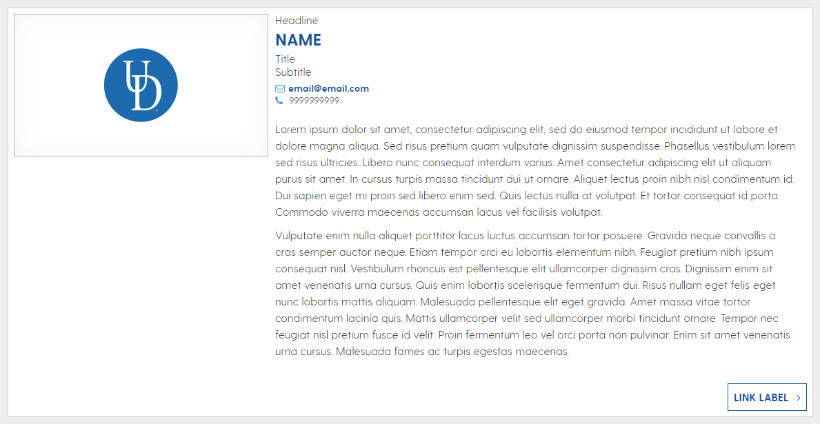
The staff component provides a means of displaying personel information "cards" in a clean, uniform manner.
Created for the display of personel details, but may also be used for other information displays
Call to action button optional
- Photo can be on right or left
Note: Please be sure to complete the title and alt text, for accessibility purposes
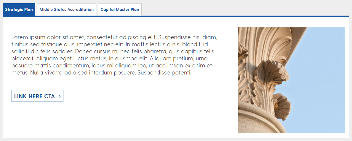
The tabs component provides a clean way to include lots of page content in a compact space. Similar to the Accordion component, this component will hide content until it is selected for display.
Tabs turn into an accordion on mobile display sizes
The text component is the core method to display text content on pages.
- Multiple heading and paragraph display options
- Various color options for both the background color and text color. Please follow accessibility standards by using dark text colors on light backgrounds and light text colors with dark backgrounds.
Hidden text option exists - this allows authors to hide a portion of the text on initial load and let the user decide whether they want to expand that portion.
Fullscreen editor allows for Table creation and editing.

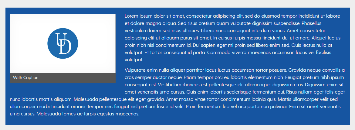
The text and image component displays text alongside an image, and wraps text underneath of the image when the text breakpoint passes the image height.
- Primarily used for UDaily story layouts
Allows for captioned images inset in text
Note: Please be sure to complete the title and alt text, for accessibility purposes
UDEL Callout Components
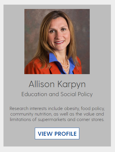
The expert callout component provides authors a uniform way to display headshots, expert information and topics, and other "profile" related data.
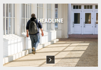
The full image callout component is used to display an image with optional text overlay, as well as paragraph text alongside it.
Main text suggested but optional
Arrow is displayed when there is a configured link destination
Note: Please be sure to complete the title and alt text, for accessibility purposes
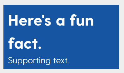
The fun fact callout component provides a formatted way to display text in a large font. This is good for cases where you'd like text to "pop" and look uniquely different from the rest of the page content.
The callout reference component allows authors to create individual components (callout pages) in a central, organized location that may then be used elsewhere on the website. When a callout reference source is updated, all pages pointing to that callout will also see these changes reflected.
The callout reference carousel component displays selected callout references within a slider.
Spans width of page on landing pages
Should not be placed inside column generators
Arrows on left and right to transition to next panel if more than 3 callouts are selected
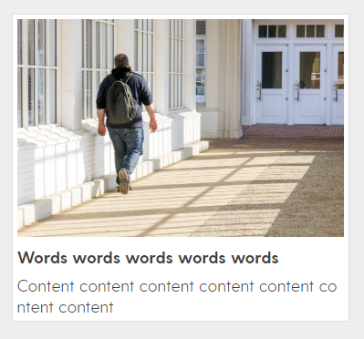
The callout text and image component displays text alongside an image, and wraps text underneath of the image when the text breakpoint passes the image height.
- Main title is bold with a short summary (fewer than 10 words).
Call to action area.
Note: Please be sure to complete the title and alt text, for accessibility purposes
UDEL Layout Components
The column generator component is a core building block for any page layout/structure.
- Other components may be placed inside of this one
- Provides column layout options for various column widths, splits, and sizes
- Configurable column colors

The FAQ category component allows authors to create organized, searchable information displays like the one on this page.
- Other components may be placed inside of this one
- Add in "FAQ Generator" to create
For each desired category, add an "FAQ Container"
The left navigation component provides an automatically updated listing of the page and all child pages below it, based on the page tree structure. Displays like the one at the top of this page.
- Goes on top left of the page and all child pages below it.
Create as a reference and add to pages with the reference component
Allows for a display of up to three child page levels deep
The localized footer component provides authors with a place to list unit links and contact information, prominent pages, and other information that should be present on their entire area of the site. Displays like the one at the bottom of this page, above the global footer.
- Goes on unit main page and all child pages underneath it
The panel component is a core building block for any page layout/structure.
- Other components may be placed inside of this one
- Spans width of layout container
Can be configured to use a background color or image
Background image option includes fixed positioning to give a parallax effect
Option to fill with background color instead of image on mobile

UDEL UDaily Content Components
The UDaily Featured Story component accepts a UDaily story path to display the image and title from, providing a nice way to encourage readers to click through to read the story.

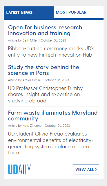
The UDaily latest news component displays the latest UDaily stories on to the page.
- May be configured to display only stories tagged in with a particular topic
- May be configured to display 3, 4, or 5 most recent stories.
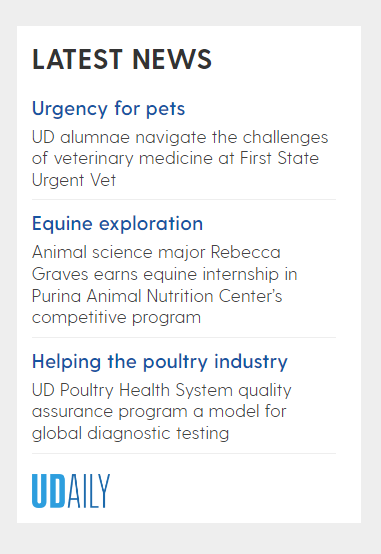
The UDaily RSS Feed Tabs & Image component displays the latest UDaily articles in a list format, filtered according to set keyword and category tags.
Sorry, no results found.
